Is there a better way?
If you haven’t visited Newbedford-ma.gov recently, you aren’t missing much. Trust me. I live here, visit the website often, and wish it could amount to something much more than it currently is. The most frustrating aspect of this website is making an online payment. It’s so hard to find sometimes! The website is similar to many other municipality and city websites across the country. It offers an overloading amount of information, is difficult to navigate, and needs a serious redesign.
It’s a curious occurrence. Why are so many municipal and government websites designed so poorly? Is it a lack of funding or lack of experience? Is it apathy? Are they attempting to provide information simply, or is it a tool used to bolster city objectives? I don’t have an answer, but I do know one thing. It’s time we start reimaging how we design these websites.
Information Architecture
Website design starts with information architecture, the art of structuring and organizing information that is most relevant and easy to locate for users. The idea is to approach information architecture with a psychological background. You can break down information architecture in the following principles.
- Gestalt principle defines how users understand visual elements based on similarity and continuity.
- Mental Models are assumptions people will create before interacting with a website.
- Cognitive Load is the amount of brainpower used by users to retain information. Cognitive load applies to providing choices for users, but users mustn’t be overloaded. Too many decisions and users will become overwhelmed and will often flee from a website. A general guideline is to include five-seven options for users, although there has been some debate recently if it makes a difference for web design.
- Recognition Pattern inform users’ decisions based on past experience. Users have come to expect a specific experience with web design. It’s essential that information architects design information that is predictable for users.
- Visual Hierarchy refers to website structuring in ways that are scannable. Users visit websites and often don’t read everything but are looking for clues to help retain information. Websites must have information chunked in readable portions.
A NewBedford-MA.gov Case Study
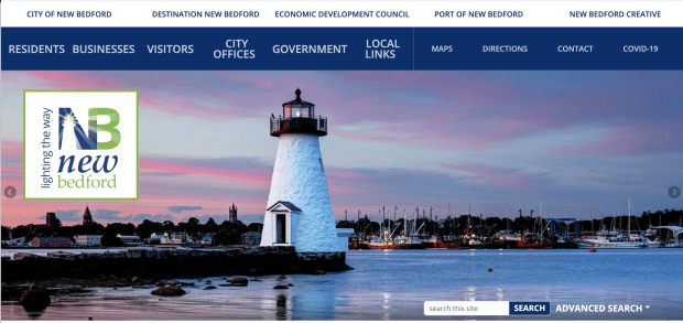
When we look at NewBedford-MA.gov, at first glance, the website greets users with some pixelated images of the city and a navigation bar that has 12 Navigation menus and also includes a second navigation toolbar. If you are looking for something specific, this gets tricky, as the website contains way too many links and not enough substance.
I developed a site map for New Bedford’s website and visually mapped out the website’s organization. Its apparent information architecture was not a priority. Gestalt’s principle and visual hierarchy need improvement. The cognitive load is not conducive for users. A total of 16 navigation links are present, and each heading contains way too many links nestled inside. For example, on the “Resident” navigational tab, there are 12 additional links. On the “City Offices” tab, there 41 links available.

Navigational Difficulties
When looking through all the links, I was surprised to see many links repeated across the navigation menu. I was also surprised to see so many dead links, links with pdf files, and many links just led users to pages that only included 100’s additional links. I’d argue a better way. Instead of creating a wall of links for one page, it might improve the user experience to include images, video, and short chunks of writing.
The content on the website is also relatively lackluster and demands a more engaging approach. For example, it’s probably not the best approach to include a link to a PDF in the navigational menu. It might be better to write a blog post about the PDF file and have it in the website’s news section.
The website also includes an abundance of information that isn’t relative to most users. For example, New Bedford consists of a header link to maps. There are links essentially linking users to a Google map of the city. I’d challenge including that specific information on the website, as people can just go to Google and search for a map if they need one. The website is missing other critical information, including the vivid arts and culture sector.

NewBedford-Ma.gov does include a search option, but it is hard to find as the location is not part of the header menu. The website does have a quick navigation window but offers information that is not relative to the user. For example, I often run into issues trying to pay a bill, as it’s sometimes hard to find the “Pay online” page.
The website also appears to be lacking a severe content strategy. New Bedford’s website attempts to fill many roles for residents, businesses, and tourists but does not align with the city’s business objectives.
It appears the city has attempted to build additional websites to fill these holes. These websites are included on the top of the page, adding a navigational menu. While the other websites offer lots of information about the city, they are all developed on different platforms, including different layouts and different voices. The city could improve these additional sites’ messaging if the sites were universal to the City of New Bedford brand and became a part of its website.
A Proposed Redesigned Architecture
I have given it much thought to how we can improve the organization of New Bedford’s website. I wanted to reorganize the website to lower the cognitive load for users and simplify the navigating process. I eliminated many pages from the website, and that content might be better suited embedded on pages instead of overloading users with choices in the navigation menu.

The Redesign
- Limiting the Header Links to four.
- Residents
- Businesses
- Visit
- Government
- Including a search option in the header menu
- Include five links per header.
- Residents
- News- On the original website, you could only access the news information from the home page. Not everyone lands on the home page and could be missing out on important information.
- Pay Online
- SeeClickFix
- Job Opportunities
- Services- This link could become a flyout link containing five important links for residents
- Businesses
- Demographics
- Community Development
- Economic Development
- Harbor Development
- NB Business Park
- Visit
- About New Bedford
- Things to Do
- Destination New Bedford
- NB Creative
- Port Of New Bedford
- Eat NB
- Transportation
- Government
- Mayor’s Office
- City Council
- Boards and Commissions
- Departments- Here New Bedford can develop an entire page devoted to the many different departments without seizing control of valuable navigation links.
- Residents
- Include four tabs of quick links on the homepage that include information and links
- COVID-19
- News
- Events
- Social
- Develop a stand alone footer that contains:
- Contact
- Calendars
- City Directory
- Social Media
Structurally speaking, the redesign simplifies the website exponentially. I think the improvements become more engaging and efficient for users. However, organization is not the only thing that will improve this website. The content itself needs vast improvement. I’d also love to develop a content strategy for the City of New Bedford, and would love to see this website become something much more than it currently is. It would be amazing to see this website become something all New Bedford residents can be proud of.